
SAS: Learning Portals and Subscriptions
SAS is missioned to make it easier for more people to use powerful analytics every day, to shorten the path from data to insight – and to inspire bold new discoveries that drive progress. Curiosity is the core of SAS and is pivotal in breaking down barriers and fueling ambition. One way SAS does so is by providing Certifications and Training for users to learn top-rated analytics skills required in today's market.
– OUTCOME: As part of the Self-Paced E-Learning Team in the Education Division, I was responsible for the design and development of learning portals and features in their existing portals in SAS's Virtual Learning Environment (VLE). All portals and features are live for customers with access in the VLE.
Type
Customer Learning Portals and Subscriptions /
Web Design, Web Development
My Role
Education Design Intern (Technical Intern)
Tools & Softwares
Adobe XD, Adobe Dreamweaver, Moodle LMS, Totara LMS
Frameworks
Bootstrap 4 & 5
Duration
12 weeks
Intern Expo 2021 Presentation
For the Intern Expo, I presented two of the portals that I redesigned and developed. During the summer, I was able to work on over 10 portals: developing new features, redesigning the portals, and even building the portals from scratch. The two that I presented at the Expo are the ones I am most proud of. Feel free to watch my presentation above or read about them below!
SAS Customer Intelligence 360 (SAS CI 360) Learning Subscription Portal
Evaluation of the Portal
Request: Take a look at the portal and modernize it.
- Organized in tabs with links to videos, courses, and other content related to each track
- Clear of where users should go; Organization and UX is good
- Not the most attractive or engaging; UI can be improved
Design Iteration #1
Suggestion from my manager: Testing out an existing layout
- Changed colors for a "modern" feel
- Still uses a tab layout
- Feels "smoother" than the original
- Added icons to be more eye grabbing
- Removed "Overview" tab that was in the original layout
- Moved description of the portal into the header
- This allows the description to be visible no matter what tab the user is on
- Connects the user back to why each tab is part of SAS CI 360
- Intoductory videos that were in the "Overview" tab are in their respective tabs
- Instead of being organized into tables, the courses are signified by a bright badge and videos are organized in a modal
Thoughts & Reviews
Although this layout is cleaner and more interactive, I wasn't very satisfied with this layout. My manager gave me the go-ahead to try something new, so it was back to the drawing board...
Wireframing
Experimented with:
- Use of a navigation bar, instead of using tabs
- Different pages for each of the learning tracks
- Using cards, represented by the squares in the wireframe
- Carousels, to cycle through cards on pages with much more content
- Colors and gradients for a modern look to the portal
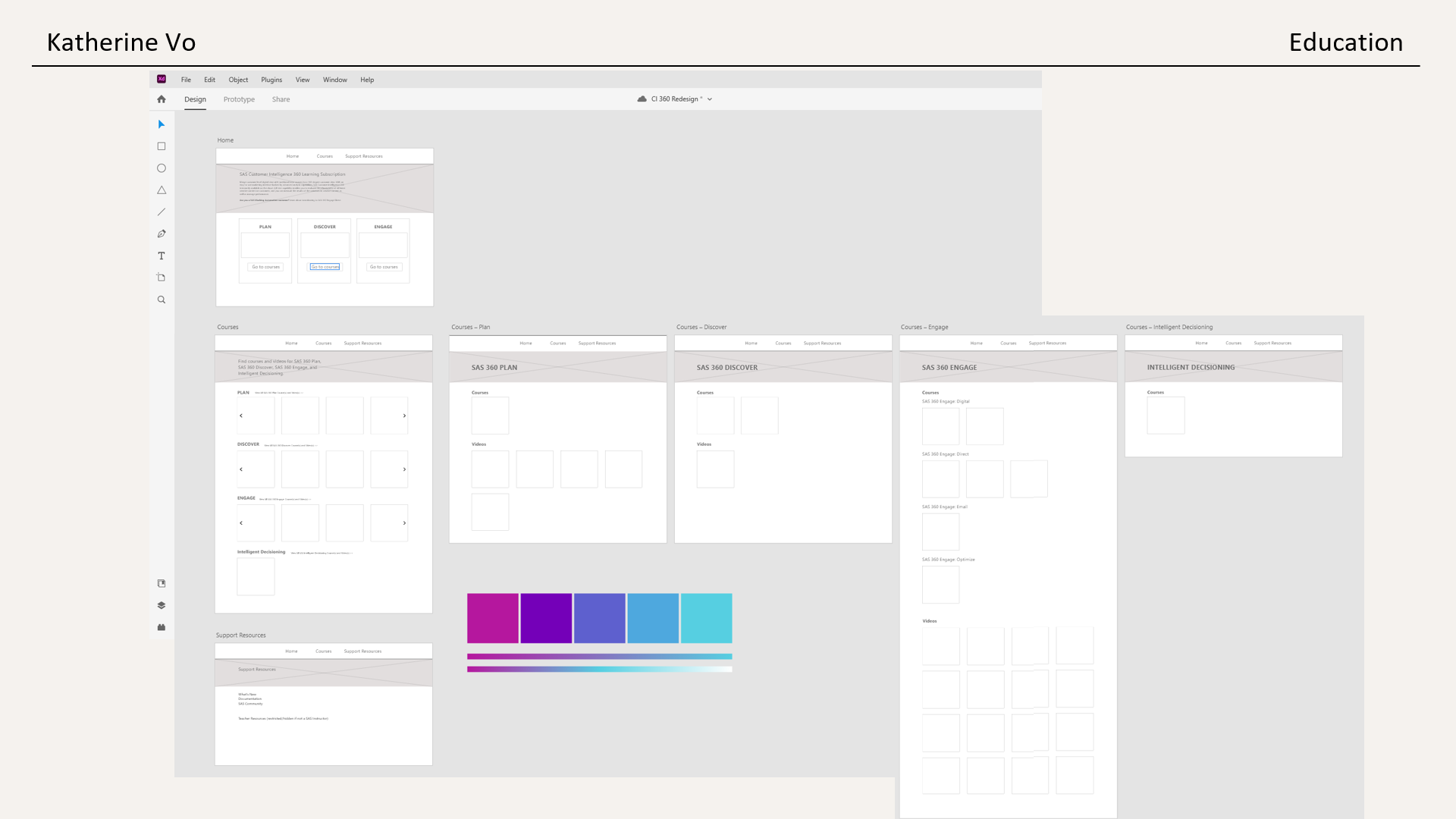
Final Look
After some feedback, this was the final iteration of the portal design.
- Decided to keep the original overview section but redesigned it as the landing page
- Added SAS CI 360 logo to the navigation bar, a nice touch to tie in the look
- All learning tracks in SAS CI 360 are in the "Learn" dropdown, taking you to its respective courses and videos
- On each page, courses and videos are separated
- Card features:
- Card images from the Brand Imagery Assets
- Label identifying the card as "Course" or "Video"
- Courses have tooltips next to the course title
- This displays the course description on hover, allowing users to preview the course without having to navigate away from the page.
- New courses have a "new" badge to pop out to interested users
- Video cards, since there are many of them, are organized in a carousel
- Can be manually controlled by the arrows, or
- Animated to the next section after a certain amount of time if user is not hovering over a Video card
- Support section in the navigation bar to give students access to links for news, documentation, and community. Teacher Resources are also on this page but are not visible to the "Student" user group.
SAS Programmer Week 2021
Business Goals
- Can we release topics by day again?
- Do we need a ‘placeholder’ page for those who register early since they’re provided the access link at registration?
- Anything else cool, new or fancy we would want to consider this year? Or anything that didn’t go great last year that you’d want to fix?
Evaluation of the 2020 Portal
- Promotional Boxes: feel out of place/ doesn't flow with the rest of the page, hard to read text inside them
- Tracks: interactive boxes taking users to its own page
- Individual Track pages:
- Lists live events and shows asynchronous daily content by date
- Not very interactive
- Initial feeling: Overwhelming, information dump
- There is a card at the end of the page after scrolling quite a bit
UI elements don't compliment each other and the overall theme.
Process
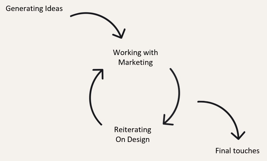
Main Question: What could be changed to ease the user flow?
- Collaborated with Marketing team for graphics and colors for the 2021 theme, requested image dimensions, and implemented marketing requests
- Generated three wireframes
- Reiterated on designs from Marketing team and Education team feedback
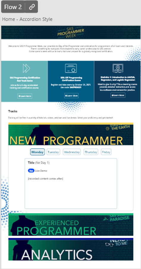
Wireframing & Prototyping
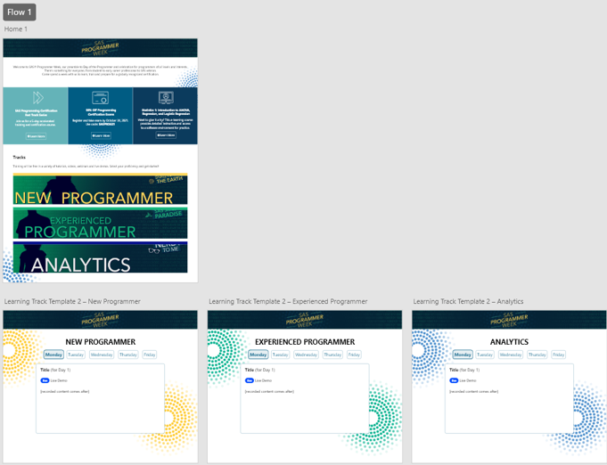
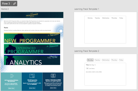
Much like the 2020 portal, this design changed the promotional boxes to be more readable and added a pill navigation within the individual track pages so that users can easily navigate through each daily content without feeling overwhelmed or having to scroll as much. This would organize live and asynchronous content in the same content box.
Drawbacks
- Limitations to Moodle LMS: After sharing the wireframes, I got feedback that Flow #2 seemed like the best option so I developed that version and asked for more feedback. However, the marketing team wanted a way to lock content until the day arrived. With the pill navigation, it was impossible to use Moodle's Restriction feaure unless you wanted to lock the entire week's content. There was also no easy solution to lock/unlock content with pure HTML and Javascript.
- Changing the Design: After evaluating what would be the most efficient, we went with Flow #1 and traded out the pill navigation for collapsibles instead. Each collapsible is coded in their own Label within Moodle, enabling me to put a date restriction on each label until the date it should be visible to learners.
- Changes to the Individual Track Pages: I separated Live Events and Daily Content in order for learners to be aware of the Live Events throughout the week instead of learning about it the day of if it was in the collapsible. These sections are labelled, unlike the 2020 portal, to make it more distinct. The Live Events section is designed in a calendar-like view to visually appear like a week.