
YesStyle Website Redesign
This project is a partial redesign of the YesStyle website, which is an online store with a wide selection of Asian beauty trends including clothing and other lifestyle products. This is a look into how filtering facets can enhance the user experience.
Type
Website Redesign / Team Project
Practices
Research, Wireframing, Prototyping, User Interviews, User Evaluations
My Role
UI/UX Researcher, UI/UX Designer
Tools
Adobe XD, Miro
Collaborators
Ali Baloch, Emily Gazda, Shane Vong
Duration
2 1/2 months
The Problem
The layout of the website overwhelms the user with a lot of information. Although navigating through the website is doable, the experience is not as smooth when trying to filter through the information for details that the buyer wants when compared to other websites.
Constraints
- Regulars may be accustomed to the current design
- Website has a lot of information, making it difficult to determine what is necessary for customers
Before...
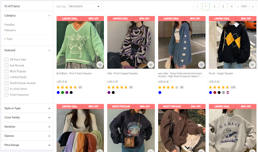
Searching for Products
- All products are tagged with a "deal"
- Not visually different unless reading the tag
- Can make users feel uneasy and deem the site untrustworthy
- Can't sort by size
- Categories aren't meaningfully different (i.e., "Limited Deals" vs. "Final Clearance" could be interpreted the same by users)
Looking at Details for a Specific Product
- Gallery is not consolidated in a grid, making it feel unorganized
- "Details" tab includes the content for the "Gallery" and "Reviews" tab meanwhile the "Gallery" and "Review" tabs only contain its own information
- Question to consider: What is the point of organizing information using tabs if it all appears in one tab?
- Random promotions in the right column
Overall, the YesStyle website provides much information but does not provide it in a concise or attractive manner.
Primary Stakeholders

Online Shoppers
Looking to buy affordable clothes and lifestyle products
User Interviews
- Began with drafting a list of questions for a semi-structured interview
- Interviewees were asked about their opinions of navigating through the site and monitored while performing artificial tasks
- Results from this interview were aggregated and divided using an affinity diagram to identify strengths and weaknesses of the current design
This was also where we were able to find our stakeholders, who believe this site is targeted to a younger population, who are looking for affordable products.
Common trends show:
- how things could be organized better
- difficulty in selecting the categories they want
- how it takes a bit longer to find things
As a result, we revised our problem statement:
The layout of the website overwhelms the user with a lot of information. The website lacks appropriate facets within their searching systems, especially for the filters and megamenu, and on the product page. This creates difficulty for the user in finding the product(s) they need.
Design Alternatives
Explored various options in how to better reorganize certain aspects of the site to enhance findability
- Documented design alternatives based on different categories
- Targeted weaknesses of the current design as identified in the affinity diagram with specific solutions
After discussing the problem and alternatives, we diverged on ideas 1 and 3, which both focuses on product information finding.
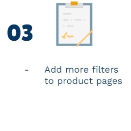
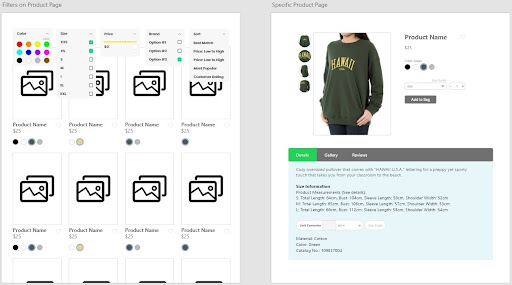
New Features
Focusing on the shopping experience
- Uses a horizontal filtering system so that options are easier to find right and so users do not have to scroll due to YesStyle's many filter options
- Size is now an option for filtering, which users considered as important in their shopping experience
- Color chips were added as another way to visually present color families
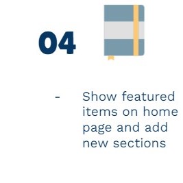
- Specific Product Page
- Better establishes information hierarchy
- Removed repetition throughout the page and within its tabs
- Organization and weight of information was moved or adjusted
- Organized gallery
Lofi Prototype
The new user experience of finding relevant information for a specific product
The video displays one of the possible user flows of refining a search and looking for information about a certain product before making a purchase. It shows the newly-added or improved functionalities that make the shopping experience smoother.
User Thoughts & Findings
We allowed users to play with the prototype by taking remote control of our screen share over Zoom. Overall, the user response to our prototype was positive.
Users liked:
- Color chips on the color pallete
- Color chips under each product
- Consolidated and improved filering system
- How easy it was to navigate
- Unit converter
From the interviews and the think aloud observations, we have found that the changes made and the new additions were necessary in order to make the website easier to navigate and understand.
"Better layout!"
"Search process is faster!"
Challenges & Takeaways
Next Steps:
- Redesigning parts of our filtering system
- Developing a higher fidelity prototype so that every selection works in order to make testing smoother for participants
- Reevaluate what facets and controlled vocabularies we could incorporate to accommodate different sizing guides
- From the interactive visits, we learned that different cultures have different standards as what constitutes for each size. We need to reevaluate what facets and controlled vocabularies we could incorporate to accommodate different sizing guides.
Reflections
- Adapted to doing online interviews where users could test the prototype by controlling our screen
- Limited participants in usability testing
- The interview process, before and after the prototypes were created, were very useful in furthering our design process. The questions allowed users to reveal the issues and the underlying needs users might encounter on the site and how to address them. Therefore, the limitations on the number of people who participated in our study could have hindered us in further findings.
Double Diamond Method
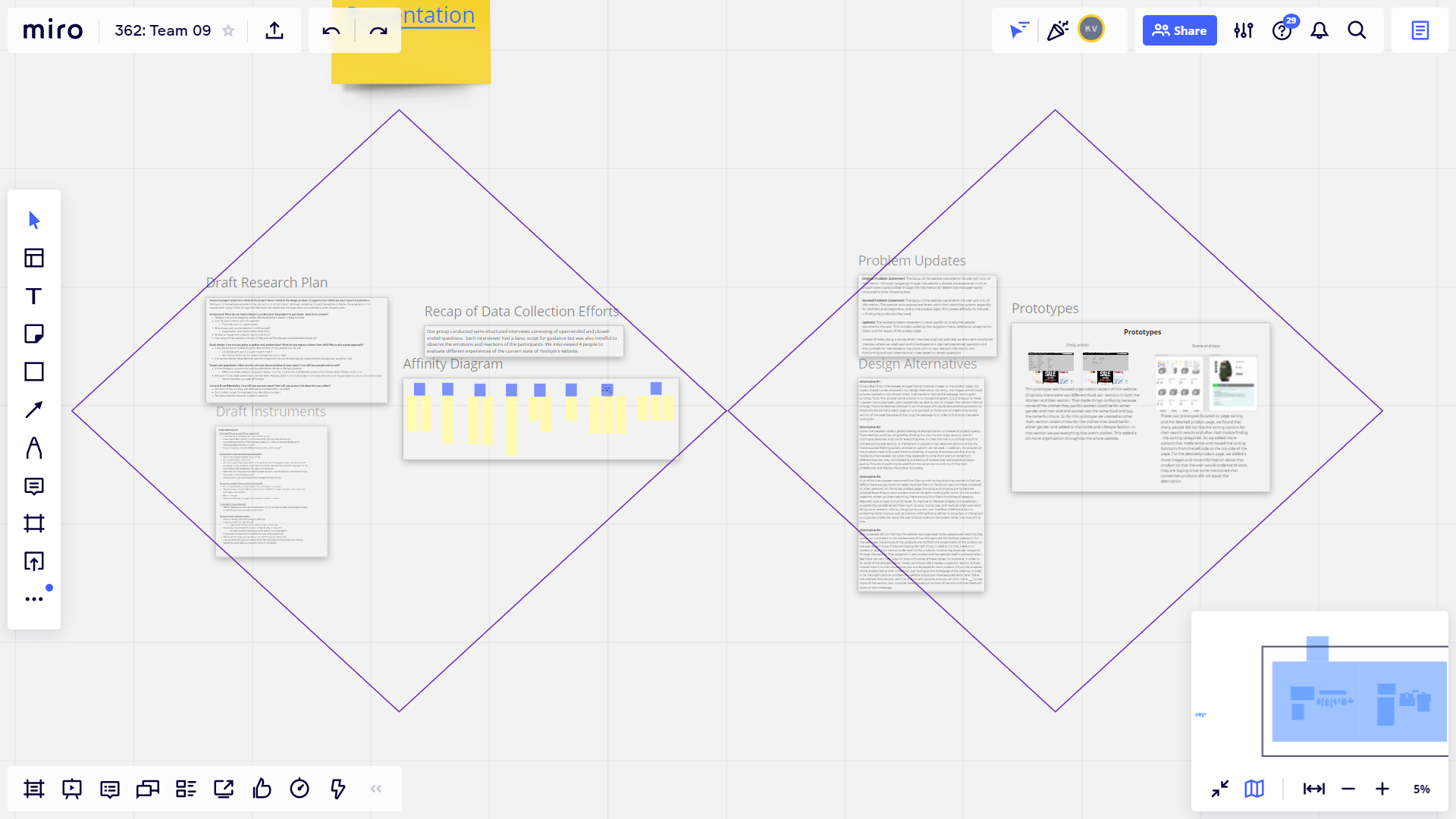
We learned that this model is not a linear approach; As we went back and forth between stages, design is an iterative process to solve the root problem.